Development / ROBLOX
A Roblox Studio help button for PC, phone and gamepad
Build a separate local help panel with safe-area insets, AnchorPoint, long-text wrapping, explicit scrolling and a clear return. Exact properties, original LocalScript and an unfilled testing plan.
 Open full-size image ↗
Small help that opens and closes clearly #
Imagine a separate practice project: a player sees the scene and a small Help button. Activating it opens an explanation; Close restores the view. This is an on-screen interface, not a prompt attached to an object in the world. It needs neither a ProximityPrompt nor a server reward or purchase check. We change local visibility and the reading position only.
This exercise does not modify the site author's five games. Build your own hierarchy in a separate Studio project. First write down three expected outcomes: help opens, its text can be read to the end, and closing works through each supported input method. A pleasing rectangle on a large monitor proves none of them. The sizes below are starting values, and the test outcomes remain for you to record.
1. Build the hierarchy with exact names #
Create a ScreenGui named HelpGui inside StarterGui. Add TextButton HelpButton, Frame HelpPanel and a normal LocalScript HelpController to it. HelpButton contains UISizeConstraint ButtonBounds. HelpPanel contains UISizeConstraint PanelBounds, UIPadding PanelPadding, TextLabel Title, ScrollingFrame Body and three TextButtons: ScrollUp, ScrollDown and CloseButton. Put TextLabel HelpText inside Body.
Do not translate these instance names along with visible labels. The code searches for HelpPanel and Body, not a similarly named object. StarterGui is the source template; during a player test, the interface appears in that player's PlayerGui. Looking only at the editing hierarchy is therefore insufficient. If WaitForChild appears to stall, check the exact name and parent before changing dimensions or replacing the event.
2. Reserve space for system UI #
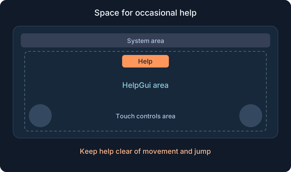
Set HelpGui.ScreenInsets to CoreUISafeInsets and ClipToDeviceSafeArea to true. Keep Enabled true. ResetOnSpawn=false preserves this interface across respawning in the exercise; it does not save progress between visits. The current safe-area setting accounts for Roblox core UI and device areas. Do not begin with a universal IgnoreGuiInset=true recommendation: it changes inset behaviour rather than solving every layout problem.
The safe area does not know where you put your own timer, map or shop. It is not a system that automatically separates every on-screen element. Start without your own HUD, then check the actual neighbouring elements of the intended interface. If another ScreenGui covers the button, inspect your display order and layers. Making the text smaller will not resolve an unrelated overlay.
3. Why this example puts Help near the top centre #
For HelpButton use AnchorPoint=(0.5,0), Position=(0.5,0,0,12) and Size=(0.28,0,0,44). Set ButtonBounds.MinSize=(96,44) and MaxSize=(160,44). These are our initial values within HelpGui's area, not universally optimal dimensions. The horizontal coordinate follows the container's centre; the upper gap is an offset in pixels.
We keep an occasional help action away from the lower touch movement and jump zones. Reaching upwards can be awkward for a frequent action, especially on a tablet. This is therefore a reading aid used occasionally, not a new combat control. Check your own upper counter and chat too. If players need the panel constantly, revise its placement from real-device observations while preserving movement access. Safe-area placement alone cannot establish comfortable reach.
4. Size the panel without stretching it indefinitely #
Set HelpPanel.AnchorPoint=(0.5,0.5), Position=(0.5,0,0.5,0), Size=(0.88,0,0.86,0) and Visible=false. PanelBounds uses MaxSize=(520,420) and MinSize=(0,0). PanelPadding supplies 12 pixels on each side. Scale is a fraction of the container and Offset adds pixels; the four UDim2 numbers are not four absolute screen coordinates.
A central AnchorPoint keeps the centre stable when dimensions change. A maximum width prevents a short hint becoming a huge strip on a monitor. A narrow screen makes the panel smaller, so its contents need a separate check. The table specifies initial properties for the remaining objects. If usable height cannot accommodate the heading and buttons, change the composition. Neither a constraint nor a percentage guarantees a usable layout in every imaginable window.
| Object properties | Initial exercise values |
|---|---|
| HelpGui · ScreenGui | ScreenInsets=CoreUISafeInsets; ClipToDeviceSafeArea=true; Enabled=true; ResetOnSpawn=false; DisplayOrder=10; ZIndexBehavior=Sibling |
| HelpButton · TextButton | AnchorPoint=(0.5,0); Position=(0.5,0,0,12); Size=(0.28,0,0,44); Visible=true; Active=true; Selectable=true; ZIndex=2; TextSize=20; TextScaled=false; TextWrapped=true |
| ButtonBounds · UISizeConstraint | MinSize=(96,44); MaxSize=(160,44) |
| HelpPanel · Frame | AnchorPoint=(0.5,0.5); Position=(0.5,0,0.5,0); Size=(0.88,0,0.86,0); Visible=false; Active=false; Selectable=false; ZIndex=2; BackgroundColor3=(20,30,44); BackgroundTransparency=0; BorderSizePixel=0 |
| PanelBounds · UISizeConstraint | MinSize=(0,0); MaxSize=(520,420) |
| PanelPadding · UIPadding | PaddingLeft / Right / Top / Bottom = (0,12) |
| Title · TextLabel | Position=(0,0,0,0); Size=(1,0,0,28); TextSize=22; TextScaled=false; TextWrapped=false; BackgroundTransparency=1; Active=false; Selectable=false; ZIndex=3 |
| Body · ScrollingFrame | Position=(0,0,0,40); Size=(1,0,1,-96); CanvasSize=(0,0,0,0); AutomaticCanvasSize=Y; ScrollingDirection=Y; ScrollingEnabled=true; ScrollBarThickness=6; BackgroundTransparency=1; BorderSizePixel=0; Active=true; Selectable=false; ClipsDescendants=true; ZIndex=3 |
| HelpText · TextLabel | Position=(0,0,0,0); Size=(1,-12,0,0); AutomaticSize=Y; TextSize=18; TextWrapped=true; TextScaled=false; TextYAlignment=Top; BackgroundTransparency=1; Active=false; Selectable=false; ZIndex=4 |
| ScrollUp / ScrollDown / CloseButton · TextButton | AnchorPoint=(0,1); Position: (0,0,1,0) / (0.25,0,1,0) / (0.5,0,1,0); Size: (0.25,-6,0,40) / (0.25,-6,0,40) / (0.5,-6,0,40); Visible=true; Active=true; Selectable=true; TextSize=18; TextScaled=false; TextWrapped=true; ZIndex=3 |
| * | UDim2 = (XScale,XOffset,YScale,YOffset); AnchorPoint=Vector2(X,Y). Title/Body/HelpText: AnchorPoint=(0,0); Visible=true. |
| * | HelpButton/ScrollUp/ScrollDown/CloseButton: BackgroundColor3=(230,120,65); BackgroundTransparency=0; TextColor3=(20,25,30); BorderSizePixel=0; AutoButtonColor=true. |
| * | Title/HelpText: TextColor3=(245,247,250). Title.TextXAlignment=Center. HelpText.TextXAlignment=Left. HelpController.Enabled=true. |
5. Keep readable text and an independent reading area #
Give HelpText TextWrapped=true, TextScaled=false, TextSize=18 and AutomaticSize=Y. Its width follows Body, while its height grows with the text. Body uses AutomaticCanvasSize=Y, CanvasSize=(0,0,0,0), ScrollingDirection=Y and ScrollingEnabled=true. The viewing area stays limited while its contents can be taller. Separate Up and Down buttons provide another way to reach a longer explanation.
Do not shrink an entire long paragraph into barely visible letters. Improve the instruction first: one action, an expected result and a return path. Then try a deliberately longer practice version. The code creates no actual task; replace its sample text with your own. Keep button and title labels short. Wrapping the body does not cure a separate overflowing button, and seeing the opening lines does not prove the ending is accessible.
6. Choose the language of this local example #
UI_LANGUAGE accepts ru, en, de, es, zh or ar. Choose "en", for example. The dictionary changes visible labels; HelpController and CloseButton remain object names. AutoLocalize=false leaves those selected strings explicit. This sets one exercise language on the client, rather than providing a complete per-player locale selection system for a published experience.
The Arabic body is right-aligned. Mixed text, numbers, punctuation and wrapping still need visual review. German Schließen and a longer explanatory sentence can reveal a problem hidden by a short Close label. Try all six variants in a narrow viewport. Do not widen one button until its neighbour disappears. In production localization, preserve the action's meaning, verify the font and use a dedicated translation system. This small dictionary is a teaching choice, not that system.
7. Connect one LocalScript #
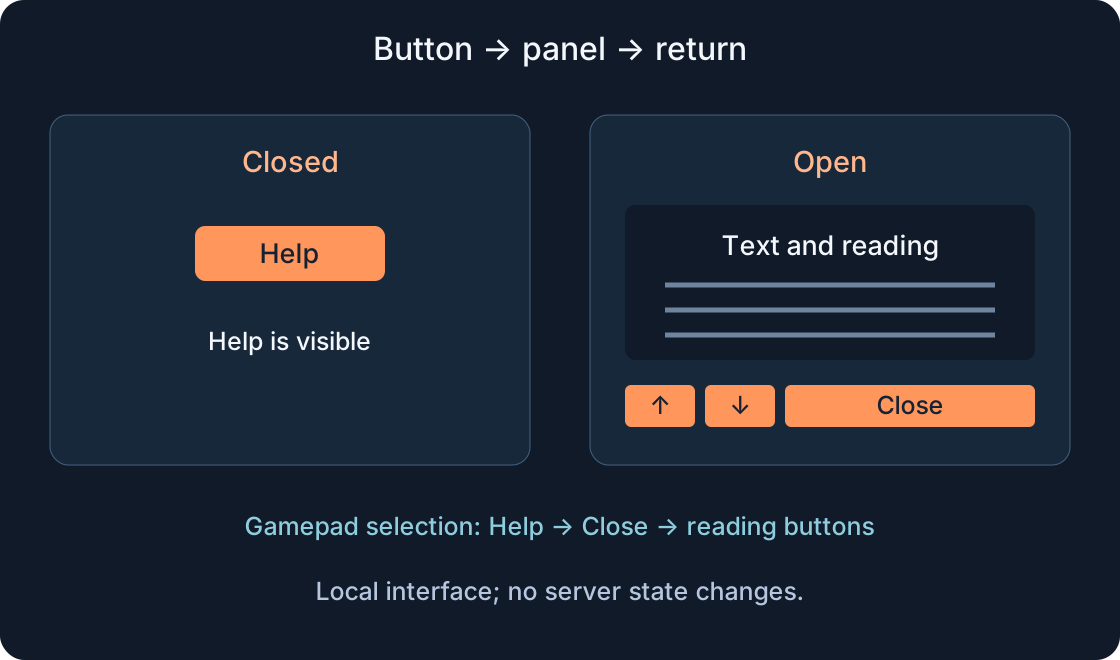
Paste the original example below into HelpController. It finds prepared objects, chooses labels, sets selection order and connects Activated. The main setOpen operation changes HelpPanel.Visible and HelpButton.Visible. An open panel hides the opening button; closing restores it. There is no RemoteEvent, server request or DataStore write.
GuiNavigationEnabled and AutoSelectGuiEnabled are explicitly enabled for this separate exercise. They affect client GUI navigation generally, so an existing game must coordinate them with its current menus. Do not add a second handler to repair a misspelled object. Our panel neither stops the character nor pauses the server's game. A modal menu that locks movement would require another behaviour and another test. Keep this first result small enough to understand from the code.
local GuiService = game:GetService("GuiService")
local gui = script.Parent
local help = gui:WaitForChild("HelpButton")
local panel = gui:WaitForChild("HelpPanel")
local title = panel:WaitForChild("Title")
local body = panel:WaitForChild("Body")
local bodyText = body:WaitForChild("HelpText")
local up = panel:WaitForChild("ScrollUp")
local down = panel:WaitForChild("ScrollDown")
local close = panel:WaitForChild("CloseButton")

local UI_LANGUAGE = "en" -- One chosen language for this local exercise.
local labels = {
    ru = {help="Помощь", title="Подсказка", up="Выше", down="Ниже", close="Закрыть", body="Это учебная панель. Прочитай подсказку и закрой её, чтобы снова видеть сцену. Здесь можно объяснить одно действие: что выбрать, какой результат ожидать и куда вернуться.\n\nЕсли текст не помещается, используй кнопки Выше и Ниже. Закрытие панели не завершает задание и не выдаёт награду."},
    en = {help="Help", title="Quick help", up="Up", down="Down", close="Close", body="This is a practice panel. Read the hint and close it to see the scene again. Explain one action here: what to select, which result to expect and where to return.\n\nIf the text does not fit, use Up and Down. Closing the panel does not complete a task or grant a reward."},
    de = {help="Hilfe", title="Kurze Hilfe", up="Hoch", down="Runter", close="Schließen", body="Dies ist ein Übungsfenster. Lies den Hinweis und schließe es, um die Szene wieder zu sehen. Erkläre hier eine Handlung: was auszuwählen ist, welches Ergebnis erwartet wird und wohin man zurückkehrt.\n\nWenn der Text nicht passt, nutze Hoch und Runter. Das Schließen erfüllt keine Aufgabe und vergibt keine Belohnung."},
    es = {help="Ayuda", title="Ayuda breve", up="Arriba", down="Abajo", close="Cerrar", body="Este es un panel de práctica. Lee la indicación y ciérralo para volver a ver la escena. Explica una acción: qué seleccionar, qué resultado esperar y adónde regresar.\n\nSi el texto no cabe, usa Arriba y Abajo. Cerrar el panel no completa una misión ni entrega una recompensa."},
    zh = {help="帮助", title="简短提示", up="上翻", down="下翻", close="关闭", body="这是练习面板。读完提示后关闭它,再次查看场景。这里可以解释一个动作:选择什么、预期结果是什么,以及之后回到哪里。\n\n如果文字显示不全,请使用上翻和下翻按钮。关闭面板不会完成任务,也不会发放奖励。"},
    ar = {help="مساعدة", title="إرشاد قصير", up="أعلى", down="أسفل", close="إغلاق", body="هذه لوحة تدريب. اقرأ الإرشاد ثم أغلقها لرؤية المشهد مجدداً. اشرح فعلاً واحداً: ماذا يختار اللاعب، وما النتيجة المتوقعة، وإلى أين يعود.\n\nإذا لم يظهر النص كله، استخدم أعلى وأسفل. إغلاق اللوحة لا يكمل مهمة ولا يمنح مكافأة."},
}
local words = assert(labels[UI_LANGUAGE], "Unknown UI_LANGUAGE")
for object, key in {[help]="help", [title]="title", [up]="up", [down]="down", [close]="close", [bodyText]="body"} do
    object.AutoLocalize = false
    object.Text = words[key]
end
bodyText.TextXAlignment = UI_LANGUAGE == "ar" and Enum.TextXAlignment.Right or Enum.TextXAlignment.Left
GuiService.GuiNavigationEnabled = true
GuiService.AutoSelectGuiEnabled = true
help.SelectionOrder = 1
up.SelectionOrder = 2
down.SelectionOrder = 3
close.SelectionOrder = 4
up.NextSelectionRight = down
down.NextSelectionLeft = up
down.NextSelectionRight = close
close.NextSelectionLeft = down
panel.Visible = false
help.Visible = true

local function fromGamepad(input)
    return input ~= nil and input.UserInputType.Name:match("^Gamepad") ~= nil
end
local function setOpen(open, controller)
    local selected = GuiService.SelectedObject
    panel.Visible = open
    help.Visible = not open
    if controller then
        GuiService.SelectedObject = open and close or help
    elseif selected == help or selected == up or selected == down or selected == close then
        GuiService.SelectedObject = nil
    end
end
local function scrollPage(direction)
    local height = body.AbsoluteWindowSize.Y
    local limit = math.max(0, body.AbsoluteCanvasSize.Y - height)
    local nextY = math.clamp(body.CanvasPosition.Y + direction * height * 0.8, 0, limit)
    body.CanvasPosition = Vector2.new(0, nextY)
end
help.Activated:Connect(function(input) setOpen(true, fromGamepad(input)) end)
close.Activated:Connect(function(input) setOpen(false, fromGamepad(input)) end)
up.Activated:Connect(function() scrollPage(-1) end)
down.Activated:Connect(function() scrollPage(1) end)
8. Activated still needs a route to the button #
Activated supports mouse clicks, screen taps and gamepad activation of a selected GUI button. With a controller, enter navigation through Select, locate the highlighted Help button, then press and release A. Pressing A without a selected GUI does not promise to open it. All four buttons need Selectable=true; the background and text should not take selection.
Opening with a gamepad selects CloseButton. Navigate left to ScrollDown and then ScrollUp, and right to return. Closing with a controller returns selection to HelpButton. Mouse or touch does not create new controller focus; an old selection on one of our buttons is cleared when that input changes the panel. Unrelated menus should not gain new focus from a simple help click. This describes our logic, which still requires real input testing.
 Open full-size image ↗
9. Understand the reading buttons #
scrollPage measures the visible body's height and moves CanvasPosition by roughly 80 percent of it. The overlapping portion helps a reader locate the continuation. The position is clamped between zero and content height minus window height. If scrolling is unnecessary, the limit is zero. Repeated activation should not move the text beyond its end.
Scrolling remains local and does not alter text or task state. We make no promise that any thumbstick automatically scrolls a selected ScrollingFrame; the separate buttons supply an explicit selection path. Also check a mouse wheel and dragging inside the area on a phone. Closing preserves the reading position until the interface changes, since our code does not reset CanvasPosition on every opening. If returning to the beginning is desired, add that as a deliberate rule.
10. Use emulation, then check a real screen #
Start Test/F5 with a player in Studio. Run/F8 without a character is not a replacement for inspecting in-game PlayerGui. Device Simulator helps examine sizes and orientations; Controller Emulator provides an early navigation check. Menu names may be localized. Compare narrow and wide views, portrait and landscape, short and long text, and open and closed states.
Then check a phone and a normally connected physical gamepad. On touch, walk and jump with help closed: controls should not cover its button. Open the panel and find Close without searching the screen's corners. An emulator does not measure your thumb's comfort on a real device or establish phone performance. The following table is an unfilled plan. Expected behaviour must not be presented as something already observed in a gameplay test.
| Scenario | Expected | Device / version / observation |
|---|---|---|
| PC, click open and close | Visibility changes; no new GUI selection is created | — |
| Phone, narrow view, both orientations | Help and Close remain accessible; controls stay clear | — |
| Every language, long body | Last line reachable; neighbouring buttons visible | — |
| Select → selected Help → A | Open and select Close; left to reading, right back | — |
| Repeated Up/Down | CanvasPosition stays within content limits | — |
| Gamepad → mouse/touch, another GUI | Old selection on our buttons cleared; unrelated selection not assigned | — |
| Close, reopen, respawn | Reading position not reset by this code; ResetOnSpawn=false | — |
11. Fix the cause and record testing limits #
When the button is absent, check Enabled, Visible, the PlayerGui hierarchy and overlays. If visible but unresponsive, inspect LocalScript, names, Active and Output. If the ending disappears, examine HelpText width, AutomaticSize, AutomaticCanvasSize and the route to the last line. If the gamepad seems silent, inspect the highlight, Selectable and GuiService.SelectedObject before replacing Activated with a mouse-only event.
The material was checked for structure, XML in our own diagrams and Luau syntax; a separate local model checked visibility transitions and scrolling limits. The code has not run in Studio, on a phone or with a physical controller. Save your exercise version and observations. A successful result is readable help with an accessible return. Later styling can improve it without mixing visual state with server progress or inventing evidence from an untested device.
Original sources
Roblox Creator Hub — Text & image buttonsScreenGui
ScreenInsets
Position and size UI objects
GuiObject
UDim2
GuiButton
GuiService
Scrolling frames
Studio testing modes