Studio / ROBLOX
Card proportions in Roblox Studio: set up UIAspectRatioConstraint
Preserve the intended element's shape without tying a square icon to a long description. Choose the target, set its width-to-height ratio and check a narrow area, layout interactions and translated text.
Identify what is actually stretching #
Start with one element: a square item picture becoming wide when its panel changes size, for example. Check whether the picture region changes shape or whether the other card elements merely move. These are different tasks. Preserving proportions means maintaining width relative to height, rather than keeping the same pixel count on every device.
Write an expected result: “The icon region remains square when its parent changes.” That is testable and does not promise to fix the entire menu. This article uses a proposed practice card; no published games or actual Studio dimensions were measured for it.
Choose the element that needs a ratio #
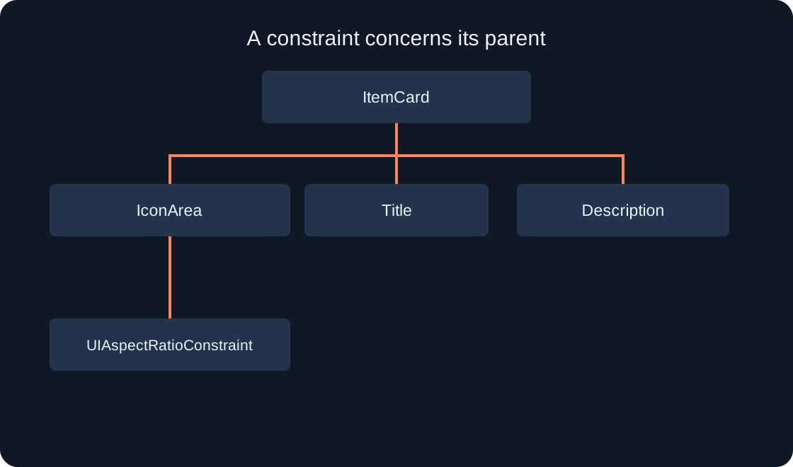
For the exercise, divide ItemCard into IconArea, Title and Description. The icon may need a square while text needs several lines. Applying a square constraint to the whole card makes the long description part of a different design problem: it still has to fit that shape.
Begin with the limited IconArea task. These are our example names; Roblox does not create the structure automatically. Make a separate Frame or use a suitable GuiObject in your prototype. If it contains an ImageLabel, check that child's placement separately: a square outer container does not describe every child image's settings.
Add the constraint under the target #
Find the exact element in Explorer and add UIAspectRatioConstraint as its child. Roblox's documentation identifies the parent GuiObject as the constraint's target. Select the constraint itself and locate AspectRatio.
Before continuing, verify the hierarchy: ItemCard → IconArea → UIAspectRatioConstraint when constraining IconArea. A constraint directly under ItemCard concerns the whole card. A similarly named element in another panel is easy to confuse with the intended target, so check the parent rather than only the property name.
 Open full-size image ↗
Set and interpret the ratio #
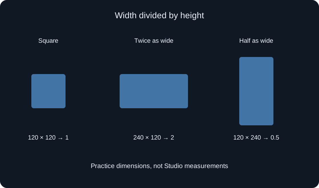
AspectRatio describes width divided by height. Set 1 for a square, 2 for a region twice as wide as it is tall, or 0.5 for a region half as wide as it is tall. Enter the numerical ratio rather than the string “1:1” or a pixel count.
Start with one ratio and do not change it at every screen size if the shape should stay consistent. Use your own square asset for a square image and inspect apparent stretching. Our three-rectangle illustration explains ratios; it is a diagram rather than a screenshot of measured UI.
 Open full-size image ↗
Separate shape from absolute size #
Squares of 120×120 and 180×180 differ in size but both have ratio 1. A 240×120 rectangle has ratio 2, while 120×240 has ratio 0.5. These are chosen arithmetic examples, not values measured in our project. They help identify a mistake when you expect a square but compare only width.
If the shape is correct but the card is too large, do not use an arbitrary ratio merely to shrink it. First inspect the container size and size-limiting tools. UISizeConstraint and UIAspectRatioConstraint address related but distinct concerns: size bounds and proportions. Check their combined effect in your layout.
| Practice dimensions | Width-to-height ratio |
|---|---|
| 120 × 120 | 1 |
| 180 × 180 | 1 |
| 240 × 120 | 2 |
| 120 × 240 | 0.5 |
Repeat with narrow and wide parents #
Keep the selected item and text, then compare two available parent areas: narrow and wide. Record parent size, the target's observed width and height, and the configured ratio. Our separate Device Simulator guide can help with device-screen comparisons. Do not combine changing a profile with replacing the card's content.
Inspect placement as well as shape: an icon can remain square yet obstruct the exit or extend outside the available area. Such observations do not contradict ratio arithmetic; they reveal another layout problem. After a fix, repeat the same pair of sizes and item.
Account for layouts and other constraints #
If the element participates in UIListLayout, its size cannot be judged solely from list settings. The documentation warns that UIAspectRatioConstraint overrides layout control of size. Record layouts and other constraints before changing several properties together.
To investigate, compare an isolated practice element with the one in your list. Use a separate prototype, preserve the original structure and record one changed setting. Do not remove a layout from the live menu simply because a standalone picture looks correct. Correct shape outside a list does not test placement within it.
Check long names and translations separately #
Try a short title and then a long string your interface can genuinely receive. Check the title, description and action availability. An aspect ratio does not choose font size or promise that every translation fits. Roblox documents text-size constraints and automatic sizing separately from proportions.
If text lacks space, decide what the player needs: a full description, several lines or a separate details panel. Do not make it unreadable merely to preserve an outer square. Our practice structure makes the icon square, allowing image shape and text space to be considered separately.
Test the action, not just the picture #
Open the card, select an item and close the panel using its intended controls. Repeat after resizing. Visually correct geometry does not prove the button handler, selection state or touch route. Those are interface behaviour checks.
Consider a fictional case: the icon is now square, but neighbouring text covers the exit and prevents activation. Record both conclusions: proportions corrected, exit route still needs checking. Do not declare the entire card ready from one screenshot. This article's example does not create real selection or closing logic.
Keep a useful result record #
Record the constrained target, parent, AspectRatio, available area, card content and layout involvement. Add expectation and observation for each arrangement. If a test is only planned, label it accordingly: a diagram and ratio calculation are not a Studio run.
For our exercise, readiness means the intended shape together with readable text and an accessible action in the selected conditions. It does not guarantee identical physical size, every device or every translation. Our original illustrations explain ratio and hierarchy rather than measurements from real games.
| Check | What to record |
|---|---|
| Constraint target | Exact element and parent |
| Layout | List and other constraints |
| Long translation | Same string at two sizes |
| Action | Selection and exit route |
Original sources
Roblox Creator Hub — Size modifiers and constraintsRoblox Creator Hub — UIAspectRatioConstraint