Studio / ROBLOX
An Inventory You Can Read: Selection and Exit
A fictional story about an inventory in a creator’s learning game, not Roblox’s official Inventory.
Context #
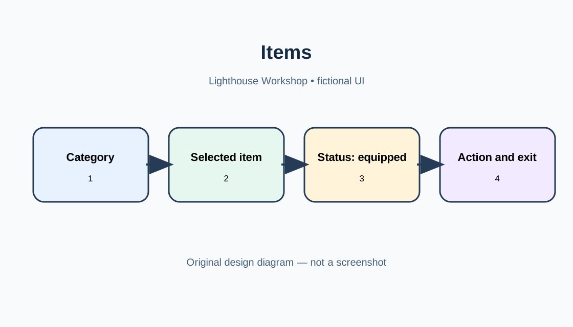
In the fictional Lighthouse Workshop, Lena searches for a lantern but the long list does not show what is equipped. This is an editorial story, not a player report or test. Inventory means a menu in the creator’s own game, not Roblox Inventory, Marketplace, or an account list. Goal: choose an item, understand its state, find a category, and close without losing context.
 Open full-size image ↗
Selection #
Separate the item being browsed from the equipped item. Show name, category, written status, and matching action: “Lantern — Equipped,” with “Unequip.” This is a design choice, not a Roblox rule. Creator Hub describes on-screen interfaces with ScreenGui and GUI objects such as Frame, TextLabel, and buttons. Ownership and equipment need a defined data source; highlighting proves neither.
| State | Show | Purpose |
|---|---|---|
| Empty | Message and next step | Understand absence |
| Items | Names and count | Compare |
| Selected | Status and action | Choose deliberately |
Empty state #
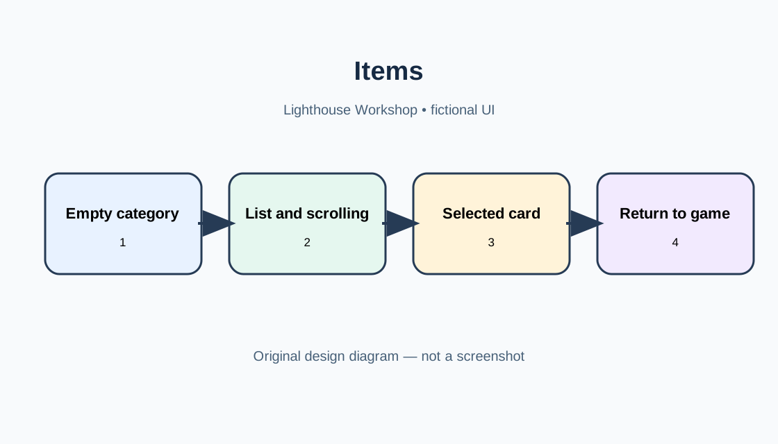
An empty category is normal. Say “Nothing here yet,” keep the category heading, and suggest a next step. Do not disguise loading or errors as empty. Groups such as Tools, Materials, and Notes should be predictable. Labels and counts help; color alone does not. UIListLayout or UIGridLayout can arrange cards as lists or grids, but does not prove usability.
 Open full-size image ↗
Scrolling #
For long lists use ScrollingFrame and align content with the visible window. Creator Hub says scrolling activates when CanvasSize exceeds the window or AutomaticCanvasSize follows content. Do not hide the final row under a footer. Avoid unexpected position resets. Narrow screens and longer translations change card height; check intended screens and input methods.
| Check | Expected | Observed |
|---|---|---|
| Empty category | Message is clear | |
| Long list | Last row is reachable | |
| Change category | Active category is visible | |
| Narrow screen and translation | Action and exit remain available |
Exit and verification #
Provide a clear exit. Creator Hub recommends considering different inputs; GuiButton.Activated is designed for mouse, touch, and a selected gamepad button. Do not promise unverified controls. After closing, return the player to the task. Tables are a design contract and plan, not results. Studio was not launched and no participants were recruited; observation cells are blank. Define the state source and allowed changes before implementation.
List structure #
Next, choose a list structure. If players need to compare names and statuses, readable rows may work better than a dense mosaic. A grid suits uniform icons when each card also has a label or accessible description. In either layout, leave room for long names that wrap to a second line. Do not shrink text until it becomes hard to read just to fit every card. Creator Hub describes UIListLayout and UIGridLayout as ways to position sibling GUI objects; density and spacing remain design decisions that need review.
Browsing and actions #
Separate reading an item from changing its state. Selecting a row might open details, while a separate button equips it; if selecting the row performs the action, the label and feedback need to say so. For an unavailable item, explain why, such as “Find this in the workshop,” instead of showing an active-looking button that does nothing. This is a proposed interface contract. TextButton and ImageButton provide activation events, but selecting a GUI object does not prove that game logic accepted a data change. Check both visible feedback and the actual game state.
Filters and search #
A category or filter should answer “what changed?” If items disappear after switching from All to Materials, show that the filter is active and provide a way to clear it. Decide in advance whether returning to a category preserves scroll position. Either choice can work; surprise and lost orientation are the problems. The count should match the items actually shown, not every item in the inventory. A search with no matches differs from an empty category: show the query and a way to clear it. Document these states before implementation so separate controls do not send conflicting signals.
Localization and accessibility #
Translation changes text length and reading direction. A short English button may be longer in German; Arabic reads right to left, and Chinese wraps differently. Do not encode meaning only in an arrow direction or button placement. Creator Hub recommends adapting layout and checking legibility and input on supported platforms; AutomaticSize can respond to content, while ScrollingFrame has AutomaticCanvasSize. These tools do not guarantee a good layout. Plan checks for long strings, enlarged text, RTL direction, clipping, and touch targets. This story does not claim to localize a particular game.
Build the mockup step by step #
Build the mockup in a deliberate order instead of starting with decoration. In Explorer, create an on-screen container and a main frame; inside it place a heading, category controls, a scrolling item area, a selected-item panel, and an exit. Start with one item and one empty category so the two states are distinct. Then add a long list and confirm that the item region scrolls while the heading and exit stay put, if that is the intended design. In Properties, review size, position, layer order, and scrolling settings. Studio labels and menus can change, so follow object types rather than relying on a promised permanent button location.
State-label pitfalls #
Avoid a common trap: the word “selected” can mean keyboard focus, a card being inspected, or equipment actually changed. Label those states separately and provide feedback after an action: what changed, what stayed the same, and how to undo it if undo is supported. Do not call an item owned by the player if the list can include found, temporary, or unavailable items. The fictional lantern example defines no ownership mechanic. The game developer must decide when an item becomes available, whether it survives a restart, and which action authoritatively changes equipment. Those are game-specific decisions; a GUI object does not decide them automatically.
Verification walkthrough #
Before finishing, reduce the design contract to a short walkthrough: open the panel; enter a category; select a row; compare browsing and equipped status; scroll to the end; close the panel and continue the prior activity. Repeat with an empty category, a long name, a translation, and every input method the game claims to support. Record device, orientation, input method, and observed result, rather than writing only “works.” If an observation differs from expectation, clarify the state and action sequence before choosing whether the layout or game logic needs revision. Until those future checks happen, the table remains a plan, not proof of success.
Legibility and touch zones #
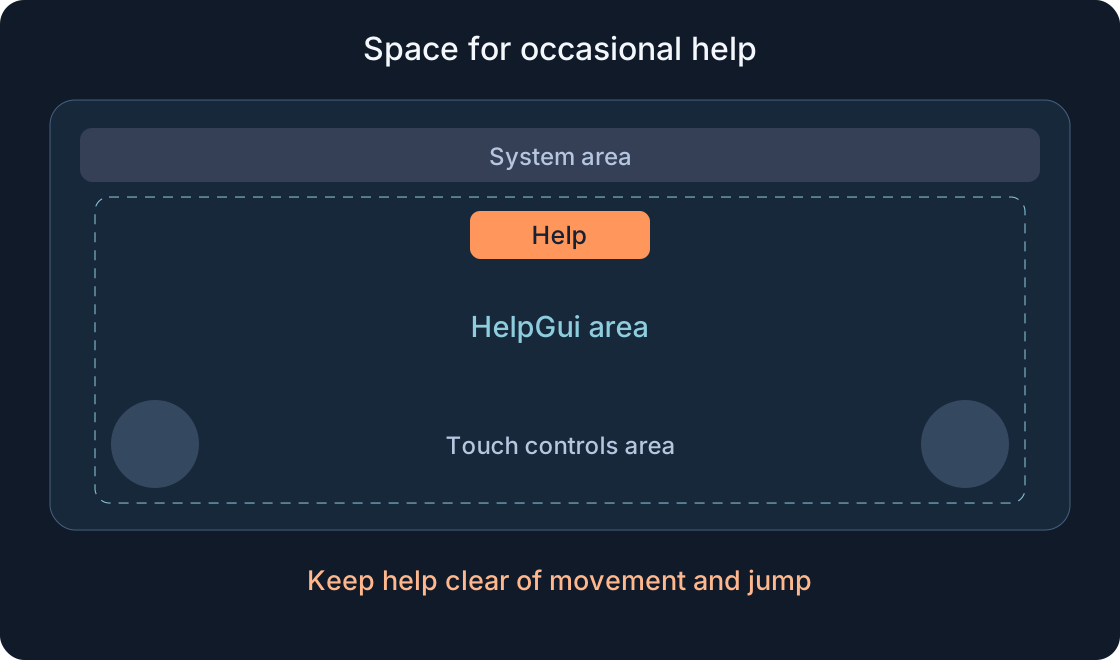
The selected row should be clear without guessing: an outline or marker can support a label, but color should not be the only signal. Check text and background contrast against different scenes. On touch devices, avoid placing important buttons in corners occupied by default controls. Creator Hub notes reserved mobile zones and recommends checking legibility on small screens. These are recommendations, not proof that this mockup is usable. The verification plan should include gamepad focus, visible focus feedback, and whether players can close the panel without precise mouse pointing.
List updates while the panel is open #
Also check data changes while the menu is open: an item may become unavailable or appear after a game event. The interface should show current state rather than leaving an outdated action enabled. If refreshing the list resets selection, communicate that or preserve context according to the team’s design. This is an implementation question, not behavior proven by the example. In the test plan, record the starting category, selected row, and event that triggered the update.
Original sources
Roblox Creator Hub — Scrolling framesRoblox Creator Hub — Adaptive design guidelines
Roblox Creator Hub — Text and image buttons
Roblox Creator Hub — Frames
Roblox Creator Hub — Size modifiers and constraints
Roblox Creator Hub — UIListLayout
Roblox Creator Hub — UIGridLayout
Roblox Creator Hub — GuiButton