Studio / ROBLOX
A phone screen in Roblox Studio: test an inventory and its controls
Use Device Simulator for one complete task: open a panel, select an item, enter a search and exit. Separate orientation, display scaling and simulation limits without promising identical performance on every phone.
Choose a small task with a clear outcome #
For the first pass, use a practice inventory: open the panel, select an item, read its description and close it. This is more repeatable than simply “test the mobile version.” Record the initial state: panel closed, no item selected and the character in the same location each time.
This is a proposed exercise, not an inventory that the simulator creates for you. You need your own test panel or existing prototype. Define the expected result yourself: for example, the selected item remains readable and the exit does not require a computer key. This article contains no actual tests of our published games.
Find the current Device Simulator and note its beta status #
The Roblox documentation checked on October 7, 2026 describes the new Device Simulator as beta. Its documented activation route is File → Beta Features → New Device Simulator, followed by restarting Studio. Save the practice project before restarting. These instructions refer to that tool specifically; beta interfaces can change.
With a place open, its toolbar sits above the 3D viewport and is available during editing and playtests. If you see the older tool, record your version and whether the new option is available rather than assuming a button must occupy a remembered location. Layout testing does not require connecting the prototype to live player saves.
Select a profile and record the starting settings #
The Phone category contains phones and tablets. Selecting a category chooses its default device; the chip displaying the active device opens the profile menu. Start with one phone and record its name, screen dimensions, orientation and Display scaling mode. These describe your test, rather than the hardware of a real visitor to your game.
Distinguish simulation profiles from Current device: the documentation describes the latter as your monitor and input without simulation. A Current device pass should not be labelled as a phone test. Keep the same starting task so that the next profile comparison concerns display behaviour rather than a different random gameplay situation.
Repeat the route in both orientations #
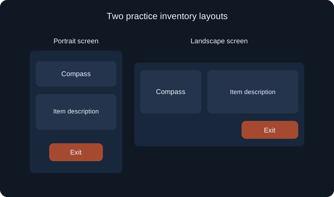
Open the panel, select the same item, read its description and find the exit. Then use Rotate for the phone or tablet and repeat. Inspect specific elements: title, selected-item row, description, scrolling and close button. Merely fitting the overall panel inside the screen is not enough.
An example expectation for our exercise is that rotation leaves the selection understandable, text does not cover the exit and closing does not activate an item underneath. These are requirements for our prototype to verify, not guarantees built into the tool. If something fails, record the step and orientation before changing it.
 Open full-size image ↗
Do not confuse convenient zoom with phone size #
Display scaling offers different ways to show the device on your monitor. Physical size targets the device's physical dimensions, Actual resolution maps pixels and Fit to window fills the available viewport. Correct physical scaling needs monitor information supplied through automatic scaling or manual calibration.
First use a convenient view to identify overlaps; separately assess text and button size with suitable physical calibration. A large button on an enlarged picture does not prove it is comfortable on a phone. Always record the mode: two screenshots of one profile can otherwise give different impressions without any change to the game.
| Display scaling | What it compares |
|---|---|
| Physical size | Physical size with calibration |
| Actual resolution | Pixel correspondence |
| Fit to window | Fitting the viewport |
Check the available input route #
With a phone profile selected, perform the task using the intended touch route: open, select, scroll and close. Touch controls lists keyboard and mouse shortcuts that simulate gestures. Follow the tool's instructions rather than guessing which gesture a drag represents.
A visible button is not evidence that its action works. Record which element you activated and which state changed. For inventories, reopening after closing is particularly useful: does an invisible panel still obstruct the next input? That is a question about your interface implementation that simulation helps you observe.
Open search and inspect the on-screen keyboard #
If your practice panel has a search field, first record its unfocused appearance, then focus it and type a short item name. Device Simulator also supports examining the on-screen keyboard. Compare whether the field, result, selected item and action needed to finish typing remain accessible.
Consider a fictional defect: the keyboard covers the only exit and the intended closing route no longer works. Record the specific sequence instead of saying “the phone is broken.” Repeat after rotating and after removing focus. You do not need to add search purely for this article if your actual task does not use it.
Compare a phone, tablet and desktop profile #
After the first phone, repeat the same route on a tablet and desktop profile. Change one variable at a time: first the profile with the same scaling mode, then orientation. Record which issues repeat and which occur only in one combination. This is easier to interpret than three unrelated gameplay sessions.
Begin with a small set you can regularly repeat. Three honestly documented passes are more useful than a long untested device list. A desktop image does not prove touch interaction; a phone profile does not prove network behaviour. Connection testing needs its own plan using Network Simulator.
Fix one problem and reproduce its route #
Describe a defect through the element and step: “the selected item's description covers the exit after rotation.” Inspect your panel's layout and state settings; the simulator does not repair them automatically. Change one cause and repeat the previous starting conditions before moving on to another improvement.
A different item with a shorter name is not proof that the earlier problem was fixed. Use the same text and state that produced the issue. Keep before-and-after records, then briefly check a neighbouring profile because a local fix can change another layout. This article describes a plan, not a completed repair.
Record results separately from real-device testing #
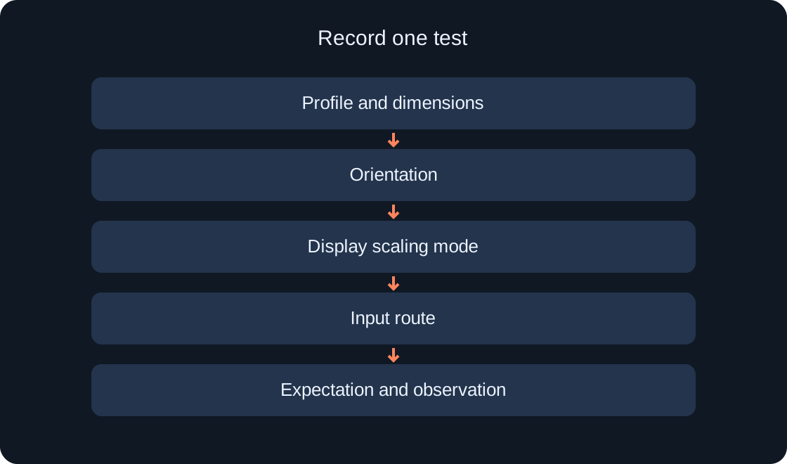
A useful record includes profile, orientation, scale, initial state, steps, expected outcome and observation. Mark the status separately as “planned,” “reproduced in simulation” or “tested on a real device.” Selecting a familiar phone model in a menu does not justify the last status.
Simulation helps examine layout and input routes, but alone does not prove identical FPS, connection quality or the absence of every bug on a particular phone. Test real hardware and networks separately when available. Our original diagrams illustrate the practice task and test record, rather than Studio screenshots or measurement results.
 Open full-size image ↗
| Record status | What it supports |
|---|---|
| Planned | A route exists, no result yet |
| Simulation completed | An observation in the recorded profile |
| Real device tested | A separate real-device pass |
Original sources
Roblox Creator Hub — Device SimulatorRoblox Creator Hub — Studio testing modes