For players / ROBLOX
Roblox settings: reduced motion and readable menu backgrounds
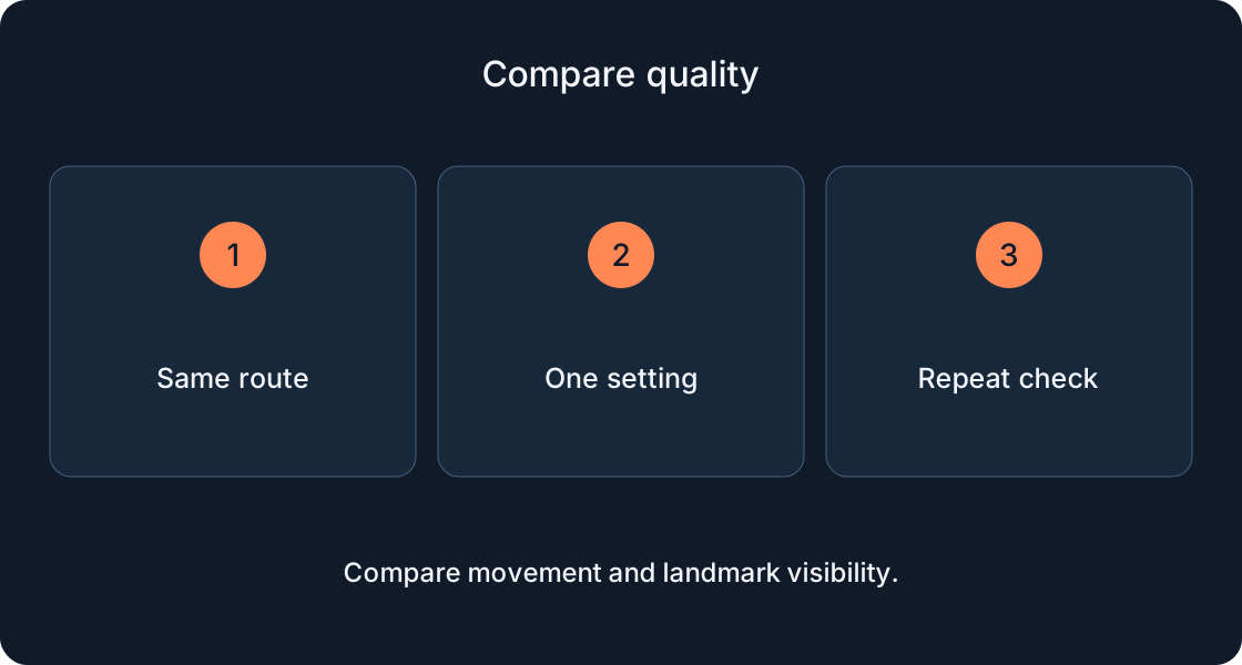
Compare Reduce Motion and Background Transparency using one clear example. Understand what interface preferences change, why custom menus may behave differently, and how to describe the result to a developer.
Choose one question to investigate #
Is menu movement distracting, or is an instruction hard to read against the scene? These are separate questions. Official Roblox help describes Reduce Motion for certain interface effects and Background Transparency for more opaque backgrounds. Avoid changing everything together, because it becomes difficult to tell which setting affected the specific situation.
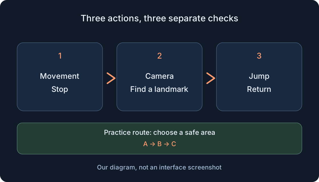
Imagine a help panel in a fictional lantern walk. It contains one instruction and a continue button. The task is to find the button, read the instruction and understand the action. This original exercise does not claim such a panel exists in your games. Choose a similar real element that can be reopened without a purchase or a progress change.
Find the in-experience settings #
Official help places accessibility options in the in-experience Settings menu alongside other preferences. Open the Roblox menu in a running experience and inspect the available entries. It may differ from a settings panel created by the game's author. A game purchase promising an improvement is not the platform setting you are looking for.
Record the device and option names actually visible. Their number and location can change; the support article and developer documentation describe different sets. An absent entry does not establish that you made a mistake. Compare current official help and the account's available functions before continuing.
Record what happens before a change #
Open the chosen panel and describe its entrance: does it slide from an edge, gradually become visible, or appear immediately in place? Separately record whether the instruction is readable and the button can be found. These observations and the current setting are enough for a short check; you do not need to assess the entire game.
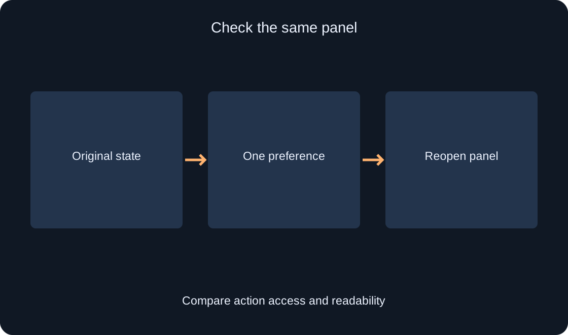
Use the same scene and panel for comparison. Changing the experience, lighting, window size and several preferences together leaves the cause unclear. A screenshot can show readability, but a still image cannot prove the transition behavior. For movement, a short description of the action and observed entrance is more informative.
 Open full-size image ↗
Compare Reduce Motion #
Reduce Motion reduces or disables certain screen effects in the app and experience. Official help gives an example where a menu fades in rather than sliding. That illustrates possible behavior, rather than promising an identical transition for every panel. Locate the available toggle, read its current state and change only that preference for the comparison.
Close and reopen the same panel. Compare its entrance and the availability of the button. The main action should remain understandable when the transition changes. Do not judge the preference solely by whether the whole game becomes still: characters, the camera and custom effects may use different implementations.
Separate interface movement from the world #
Developer documentation associates Reduce Motion with a preference to reduce UI animation movement. A custom menu needs to support this preference in its own implementation. Therefore, the toggle does not guarantee removal of every camera, platform or character movement. Name the particular effect when describing a remaining difficulty.
In the teaching help panel, compare the panel's position rather than lantern movement in the scene. Record that the panel stopped sliding while the background remained animated if that is what you observed. This is more precise than saying the setting does not work. The article promises neither higher frame rates nor a medical effect; it investigates visible interface behavior.
Compare Background Transparency #
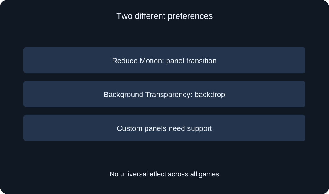
Background Transparency can make interface backgrounds more opaque for contrast. Official help states that it does not make them more transparent than their normal setting. If text blends into a bright scene, compare the same instruction against its original and more opaque background while keeping the panel unchanged.
Our original exercise reads an instruction about the next station against a busy scene. Check whether the letters are distinguishable, the button remains visible and important hints remain available. Do not expect identical backgrounds in all menus. Game-authored elements need developer support for the player's preference.
 Open full-size image ↗
Check text size as a separate step #
Creator Hub documentation also describes a text-size preference. If this option is present in the current menu, compare it separately. The same label and availability are not assumed on every device. Increasing text size and changing background opacity answer different readability questions.
After adjusting an available text-size setting, read the same instruction again. Inspect wrapping, missing final words and the button position. A custom interface may constrain text size or use another scaling method. Record the specific unchanged element instead of concluding that the entire platform is broken.
Build a small comparison table #
For each preference, record before and after values, panel entrance, instruction readability and action availability. Include only observations you actually made. An available button and an unchanged transition are separate results, and can both be true.
Do not attribute an improvement to the last changed setting when the scene also changed. Repeat under matching conditions or record the comparison's limitation. For personal use, choosing a comfortable state may be sufficient. A developer report benefits from a reproducible example with one change.
Describe a specific problem to the author #
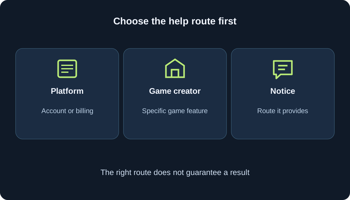
If the game's own panel remains difficult to read, include the experience, device, route to the panel, setting name and observed reaction. For example: open help, enable Reduce Motion, reopen help, and observe that the panel still slides. This is a reporting format, not a test result from a real game.
Explain which action became confusing or unavailable. Do not include passwords or private information. A named element is more useful to a developer than a general request to fix settings. Official documentation recommends accommodating player preferences, but this guide does not inspect your chosen game's implementation.
| Check | Expectation |
|---|---|
| Movement | Transition described |
| Backdrop | Readability checked |
| Button | Action available |
| Custom panel | Support not assumed |
Check the final preferred state #
After comparison, reopen an ordinary panel and perform an understandable action unrelated to purchasing. Confirm that the instruction is readable and the button easy to find. Record the chosen state and the elements that actually changed. Keep any unsupported custom interface as a separate observation.
Distinguish three outcomes: an option is available, it is selected, and a particular panel responds as expected. None proves the behavior of every Roblox experience. A repeatable check of one panel helps choose a useful preference and describe any remaining problem without guessing.
| Field | Record |
|---|---|
| Device | Actually used device |
| Panel | Path to the same element |
| Setting | Before and after value |
| Result | Only observed effects |
Original sources
Roblox — Official documentationRoblox Creator Hub — Accessibility guidelines